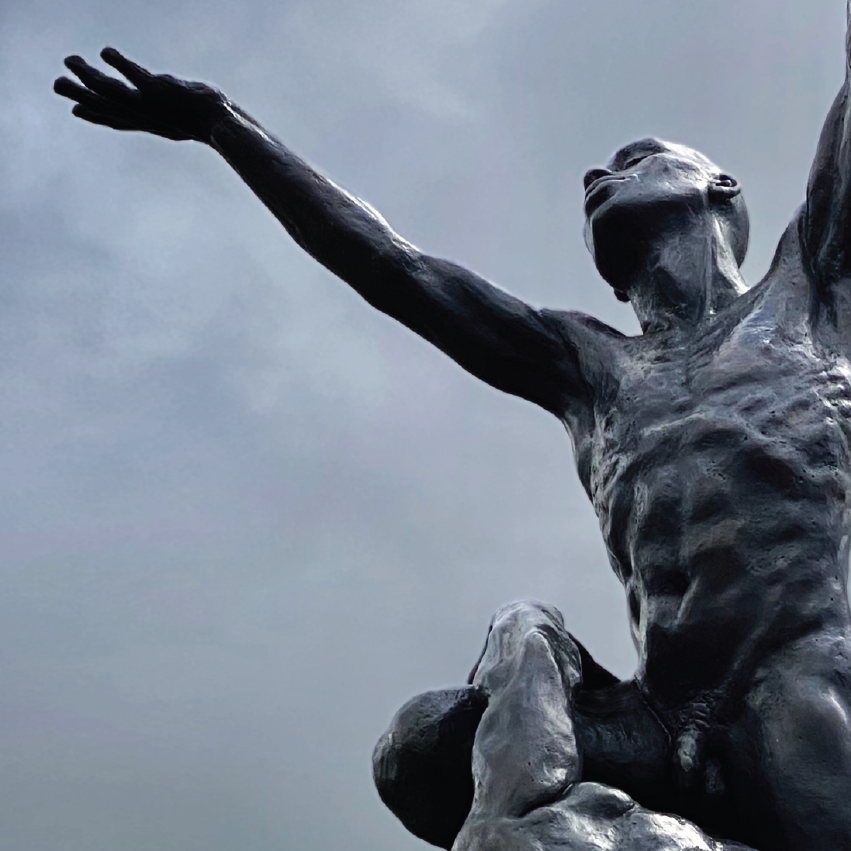
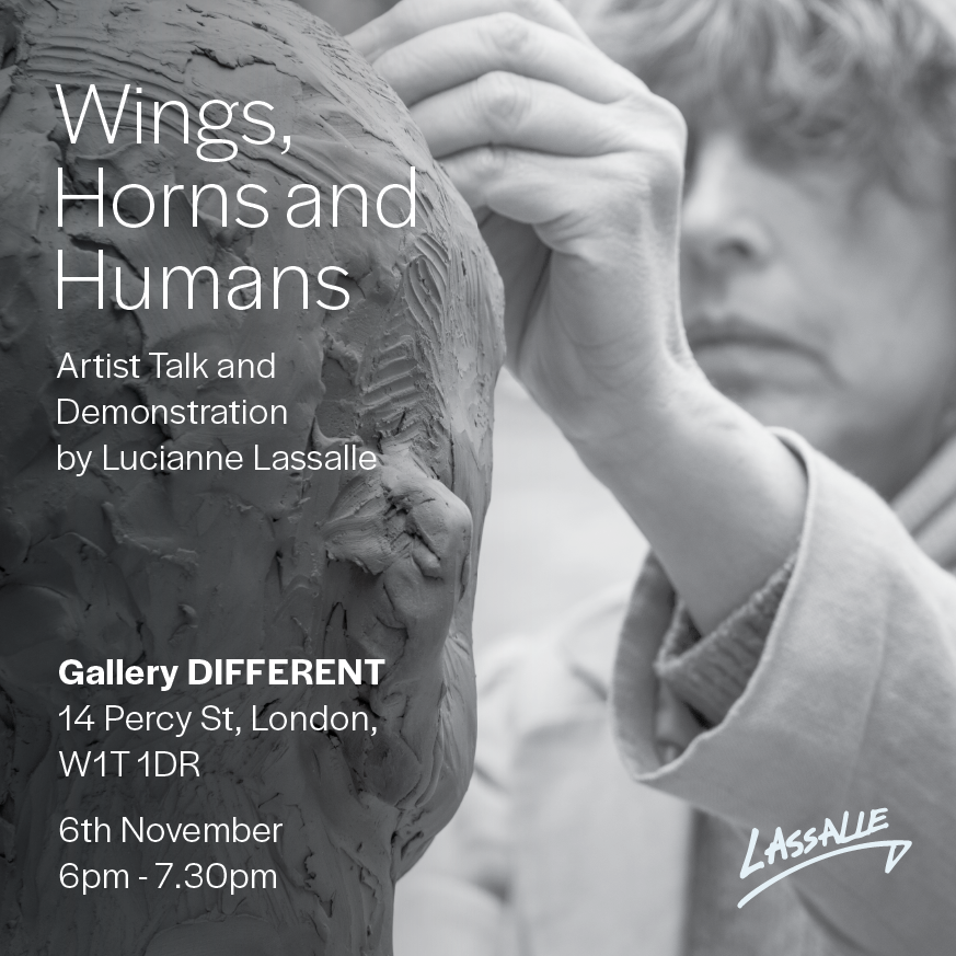
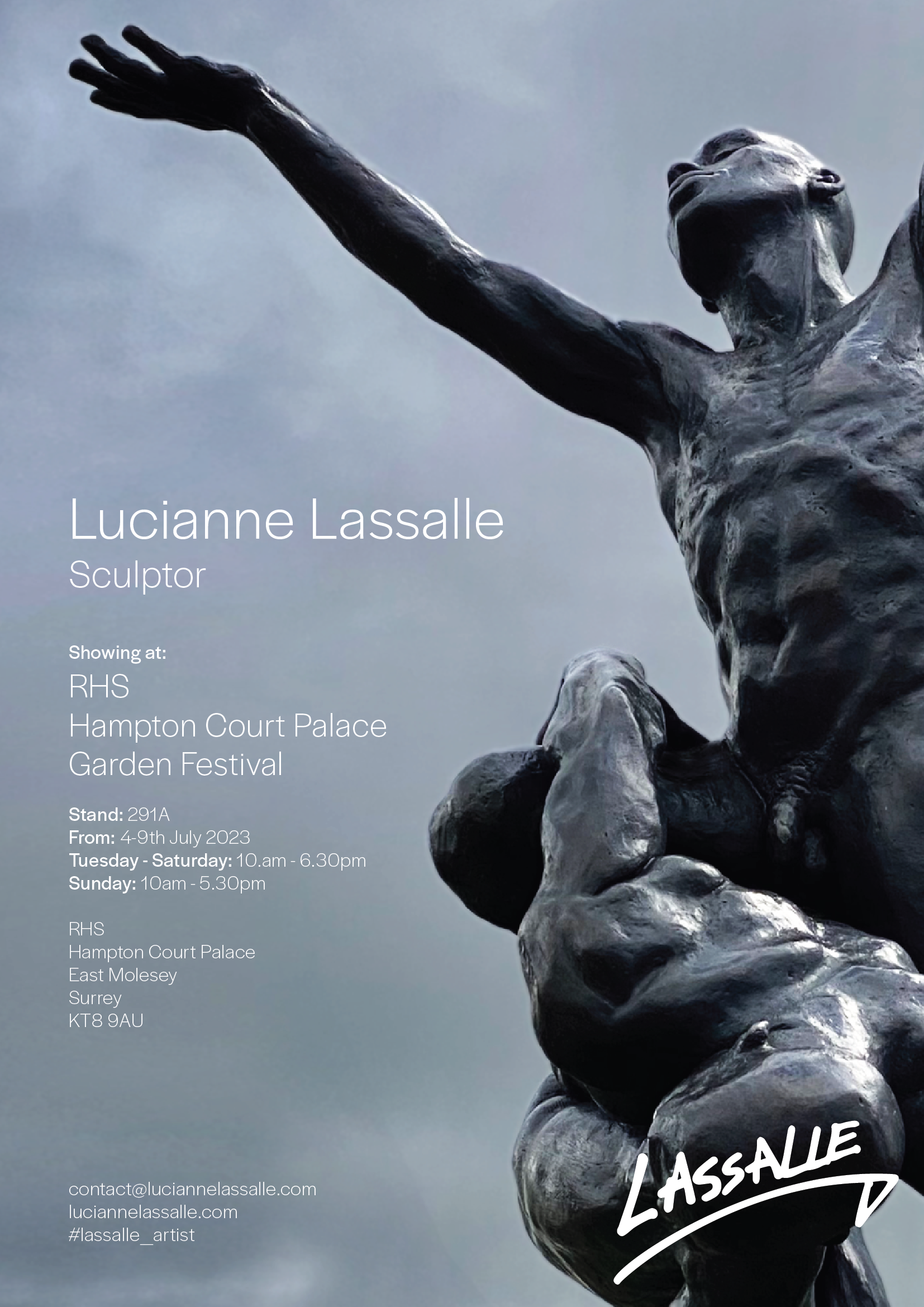
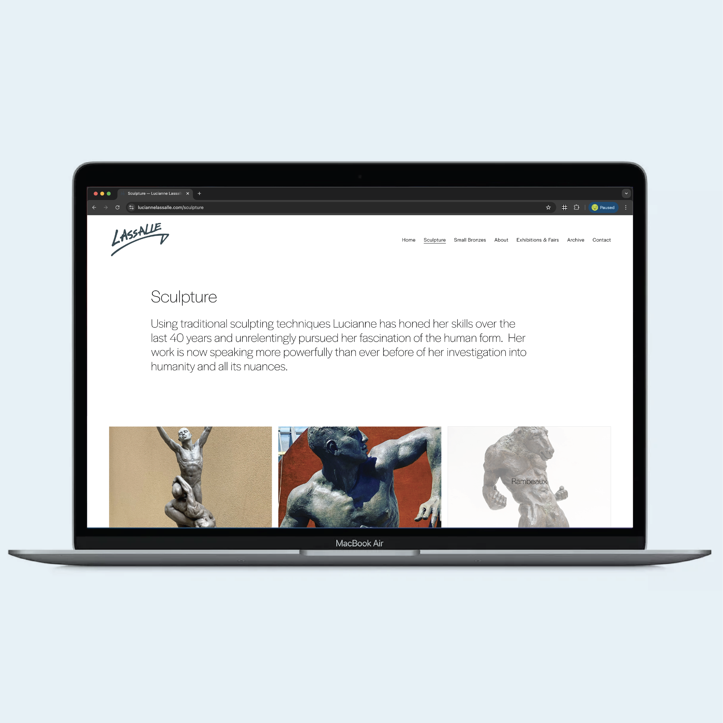
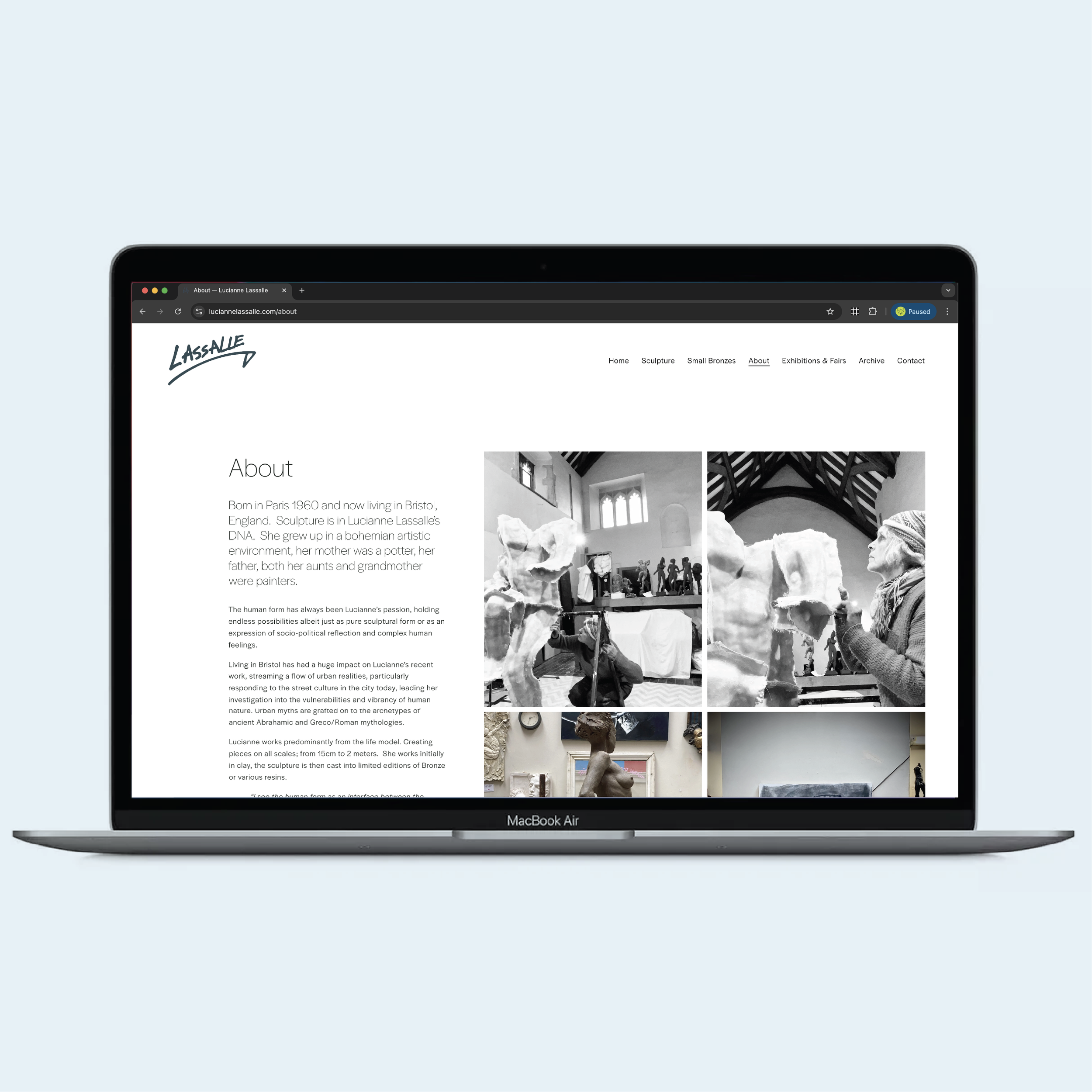
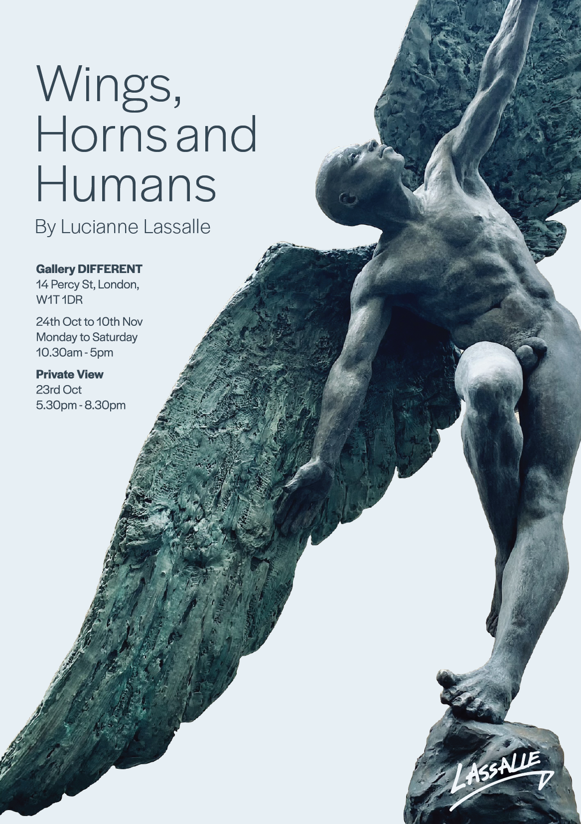
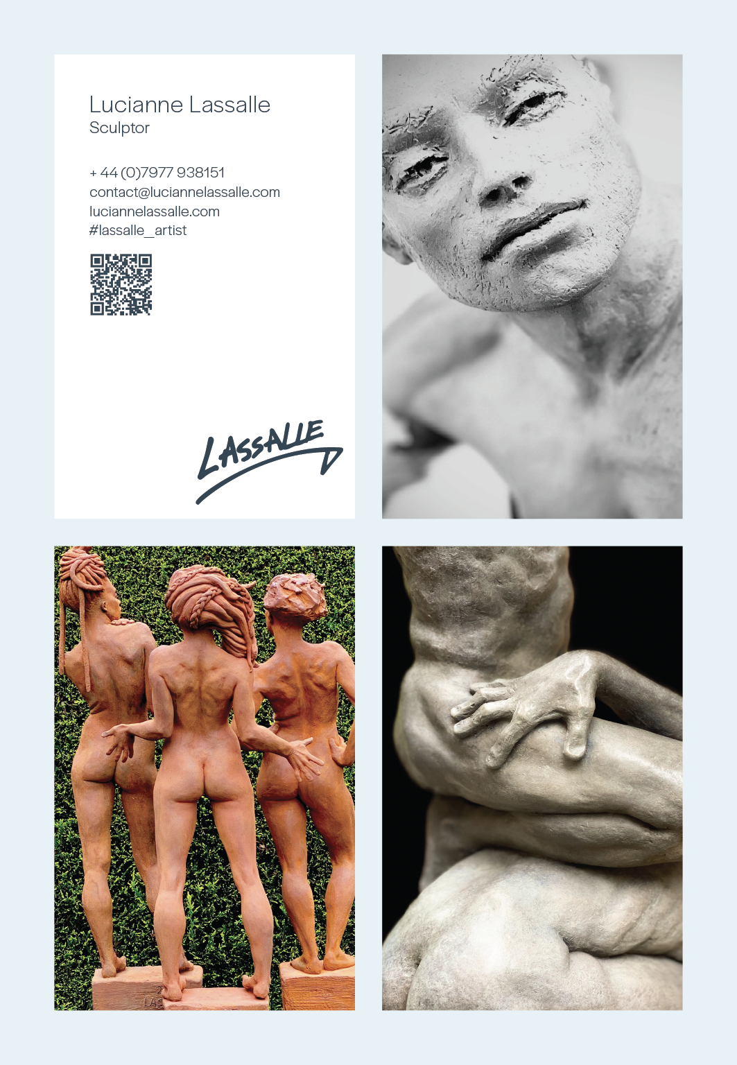
I worked closely with my sister and professional sculptor Lucianne Lassalle to design and develop her visual identity across multiple platforms, including her website, business cards, posters, and exhibition materials. The project focused on creating a refined and cohesive visual language that reflects the tactile, sculptural quality and quiet strength of her work. Through careful typography, layout, and material choices, I created a clear and elegant framework that supports the presentation of her sculptures while maintaining consistency across both digital and printed formats. The result is a considered and timeless visual presence that enhances her professional communication and exhibition profile.
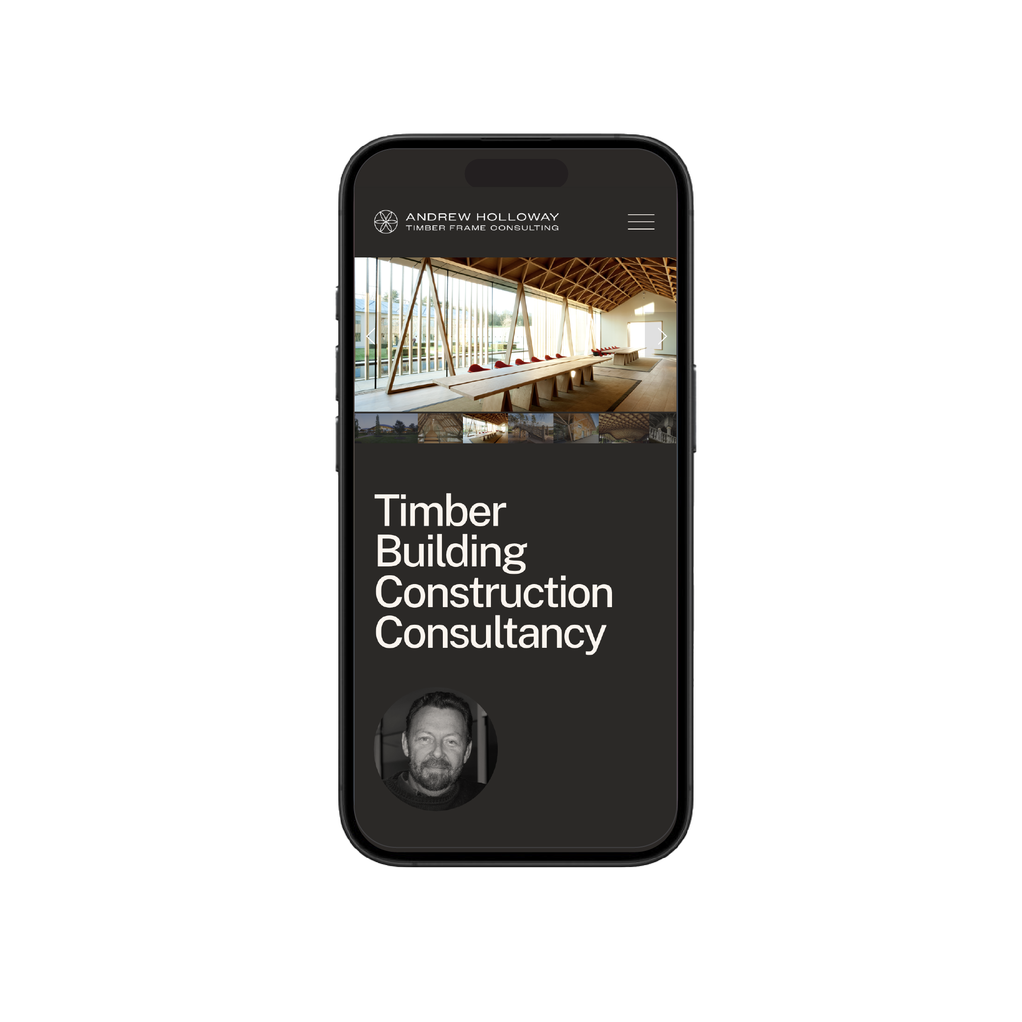
BACKGROUND: Andrew Holloway is one of the most respected voices in timber construction in the UK. With over forty years of experience spanning historic conservation and contemporary design, he advises architects, engineers and heritage bodies at the highest level. This is a consultant at the very top of his field.
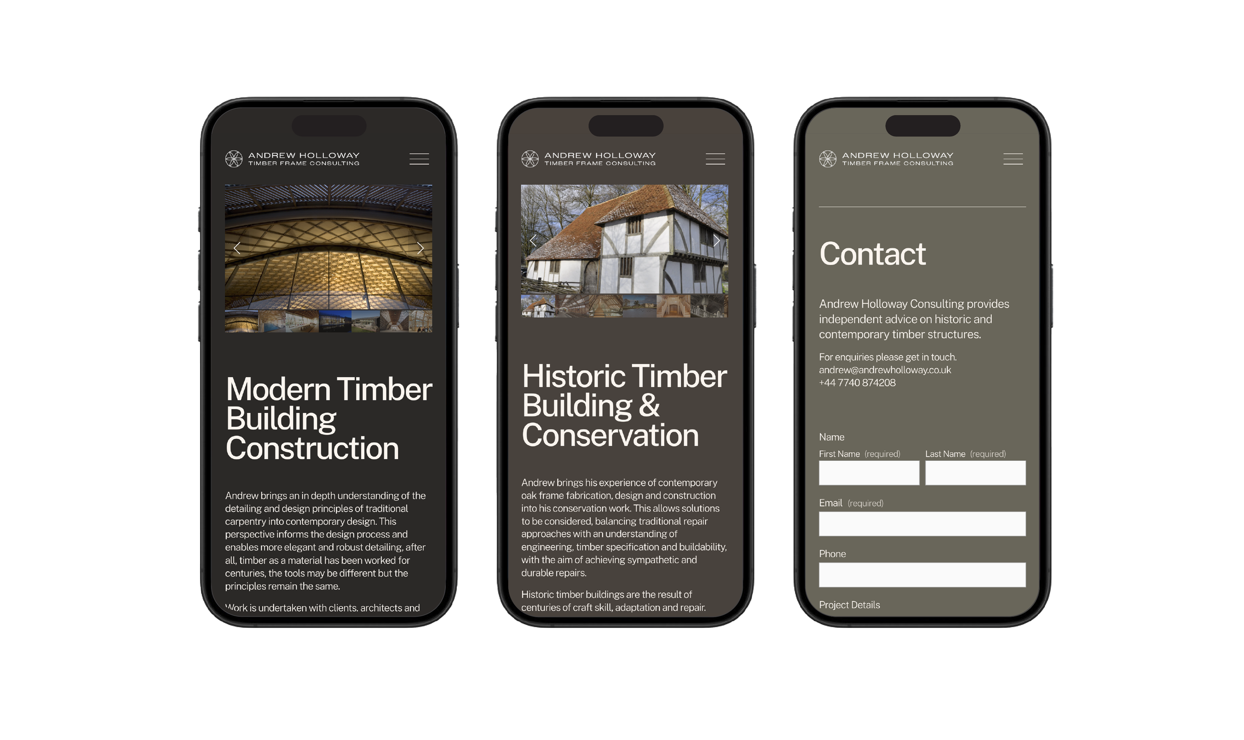
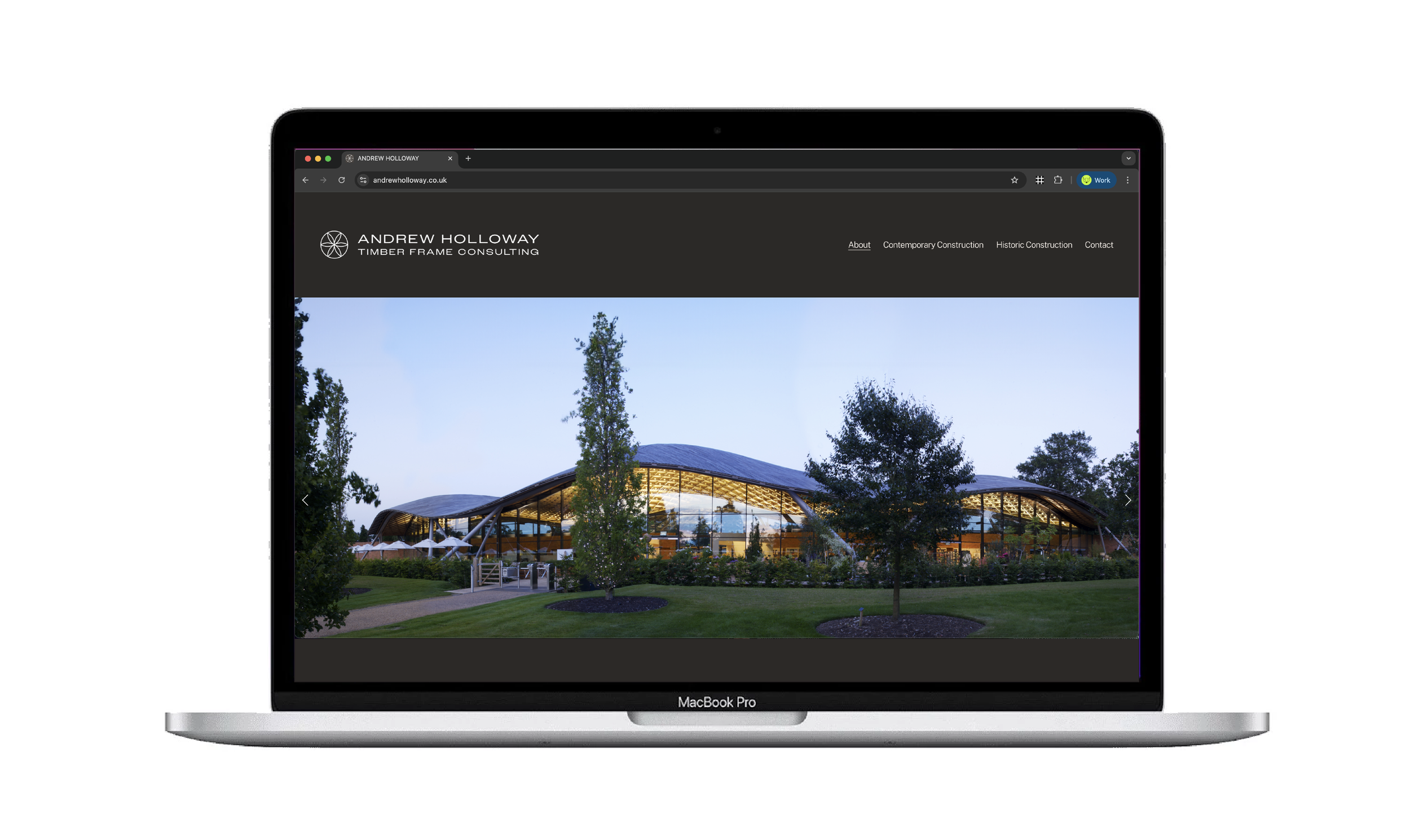
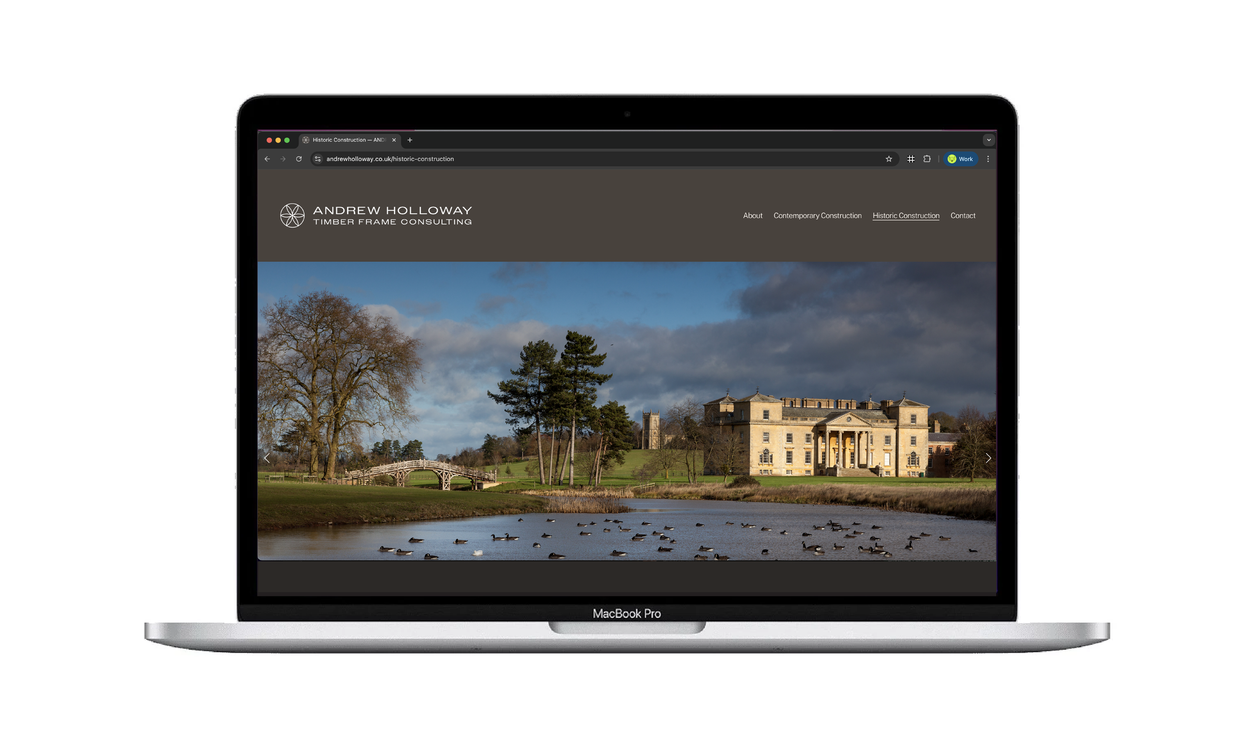
BRIEF: A clean, sophisticated identity and website that establishes Andrew's authority without overstating it. Hi-end clients, big imagery, quiet confidence.
CREATIVE SOLUTION: The logo draws on something ancient and precise. The Tree of Life, long carved into oak-frame buildings across Celtic, Druid and Norse traditions, carries deep symbolic meaning. A protective emblem. A bridge between the physical and the spiritual. A mark of permanence and of knowledge that holds things together across centuries.
For Andrew Holloway, it is entirely right. Rendered as a modern interpretation, the mark carries its history lightly. Set against clean typography and generous white space, it positions him exactly where he belongs: a world-class consultancy rooted in genuine craft.
The website follows the same logic. Space. Strong imagery. No noise. Just the quiet authority of someone with everything to show.
RESULTS: An identity and digital presence that sits comfortably alongside the architects, engineers and institutions Andrew works with at the highest level.
DISCIPLINES: Logo design, brand identity, website design and build.
A playful solution for Playful Promises
BACKGROUND: Founded by Emma Parker in 2004, Playful Promises has become a worldwide portal for buying lingerie and bras of all shapes and sizes. As they say ‘Feel nice, feel naughty, but always #FeelPlayful’
BRIEF: Design an e-commerce box and gift box solution that reflects Playful Promises ‘Mischievous, sexy, pretty or practical, but never boring and beige’ positioning.
CREATIVE SOLUTION: Taking the essence of what Playful Promises USP, we came up with a playful illustrative solution, enhanced with the ribbon bow, that could be used in various guises.
RESULTS: Working with the manufacturer, we created an ultimate lingerie gifting solution that was 100% recyclable and brought to life their USP.
'We enjoyed working on our new packaging with Laurence and his team. They came up with 3 pretty cool concepts, that we then moved forward and developed one from. The good thing is because they created artwork as part of this project, we've been able to use it in other branding exercises like on notebooks for customer free gifts etc which enhanced the value for money of the project'.
Emma Parker - Playful Promises MD
Impeccable service, impeccable design
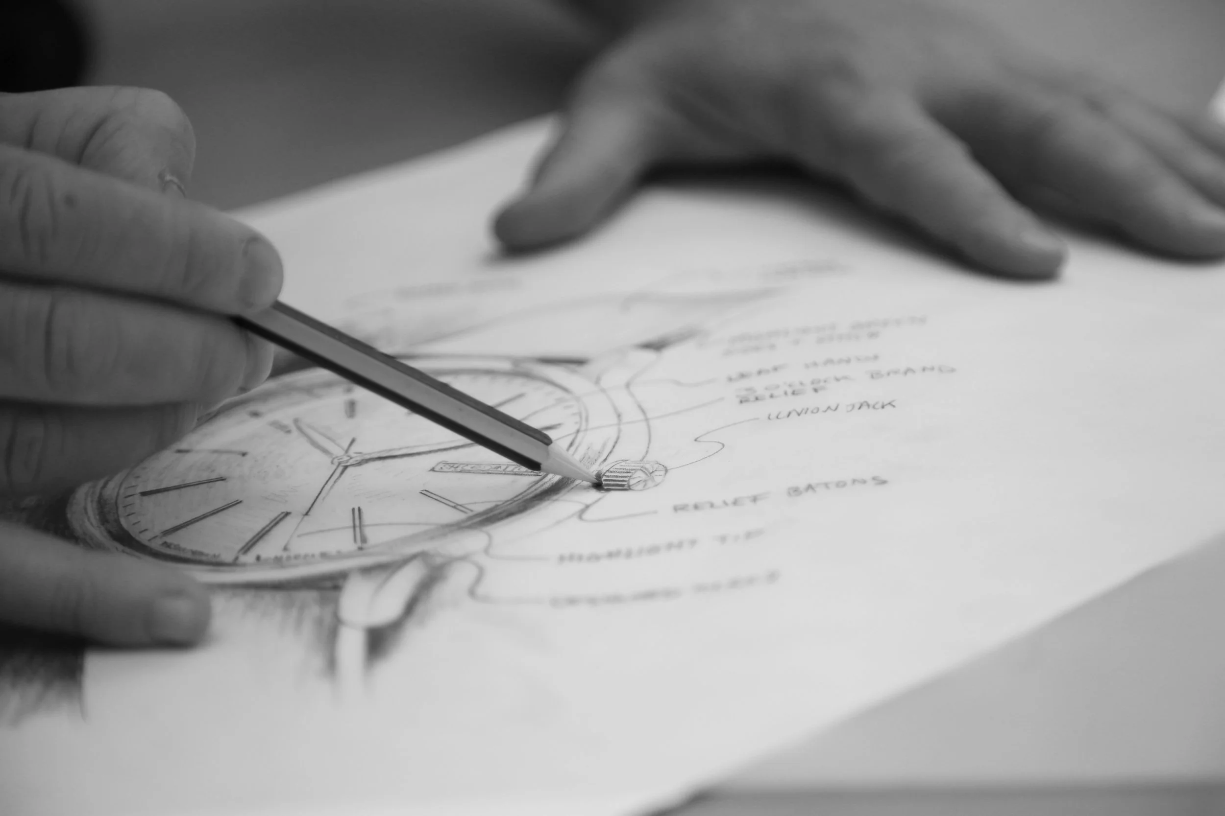
BACKGROUND: Chronotime is an international watch specialist. Selling and servicing rare timepieces. Inspired by motor racing, our client was keen to supply his clients with a unique courtesy watch, whilst waiting for yours to be repaired.
BRIEF & CREATIVE SOLUTION: Laurence worked together with the client on conceptual ideas of the brand experience. Together they shared a vision creating a sophisticated brand that reflects contemporary, cutting edge engineering. A unique watch experience that their client is proud to ‘show off’ and ‘talk’ about.
DISCIPLINES: Laurence achieved the creation of the idea, product design and manufacturer liaison including brand identity, marketing material and photography.
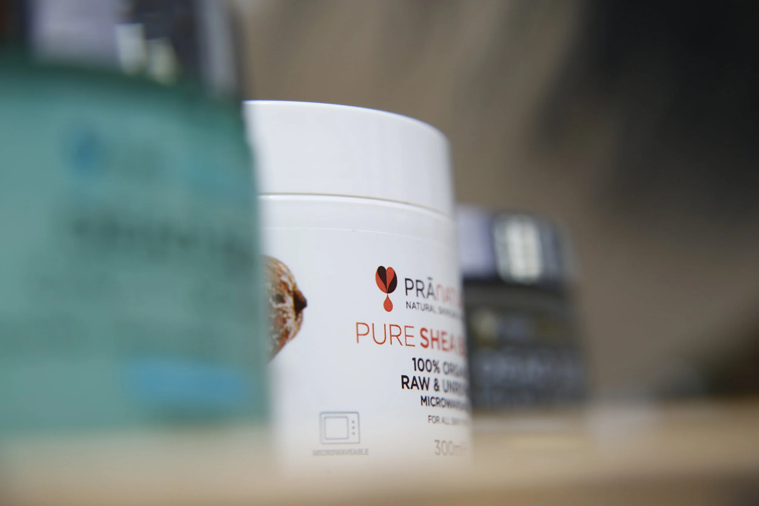
PraNaturals, as nature intended
BACKGROUND: Just Beauty, the on-line beauty platform, saw that organic, natural, pure and ethically-sourced products were gaining traction and wanted a piece of the action.
BRIEF: Create the brand mark for a range of organic, natural, pure and ethically sourced beauty products, ‘as nature intended.’
CREATIVE SOLUTION: Simplicity and purity were key in creating a memorable shorthand for the brand to stand out on-shelf and on-line. We created the leaf / heart / drop icon that summed up the brief in 1 memorable mark.
RESULTS: PraNaturals went from an initial range of 4 products to over 25 in 1 year.
DISCIPLINES: Brand design.
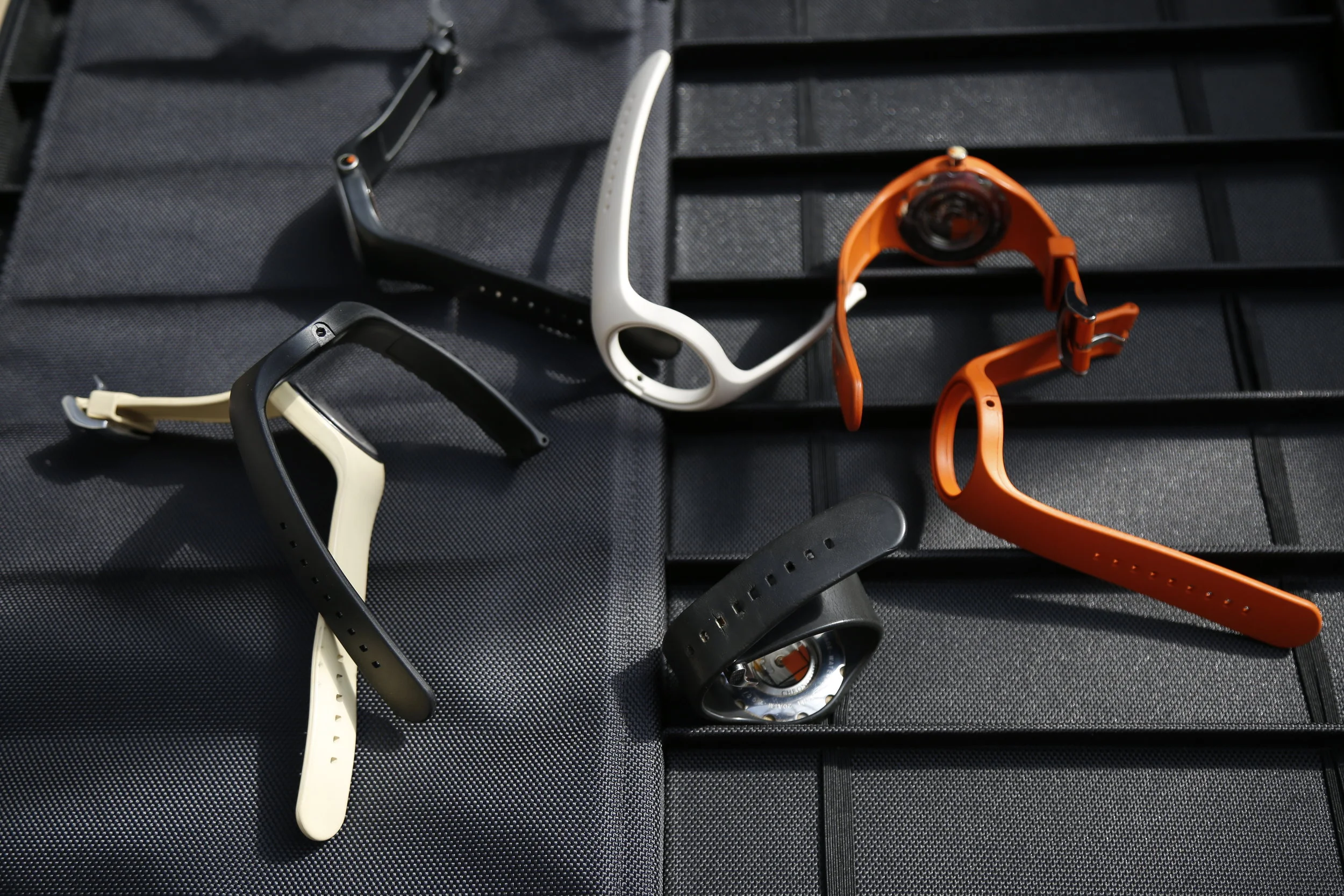
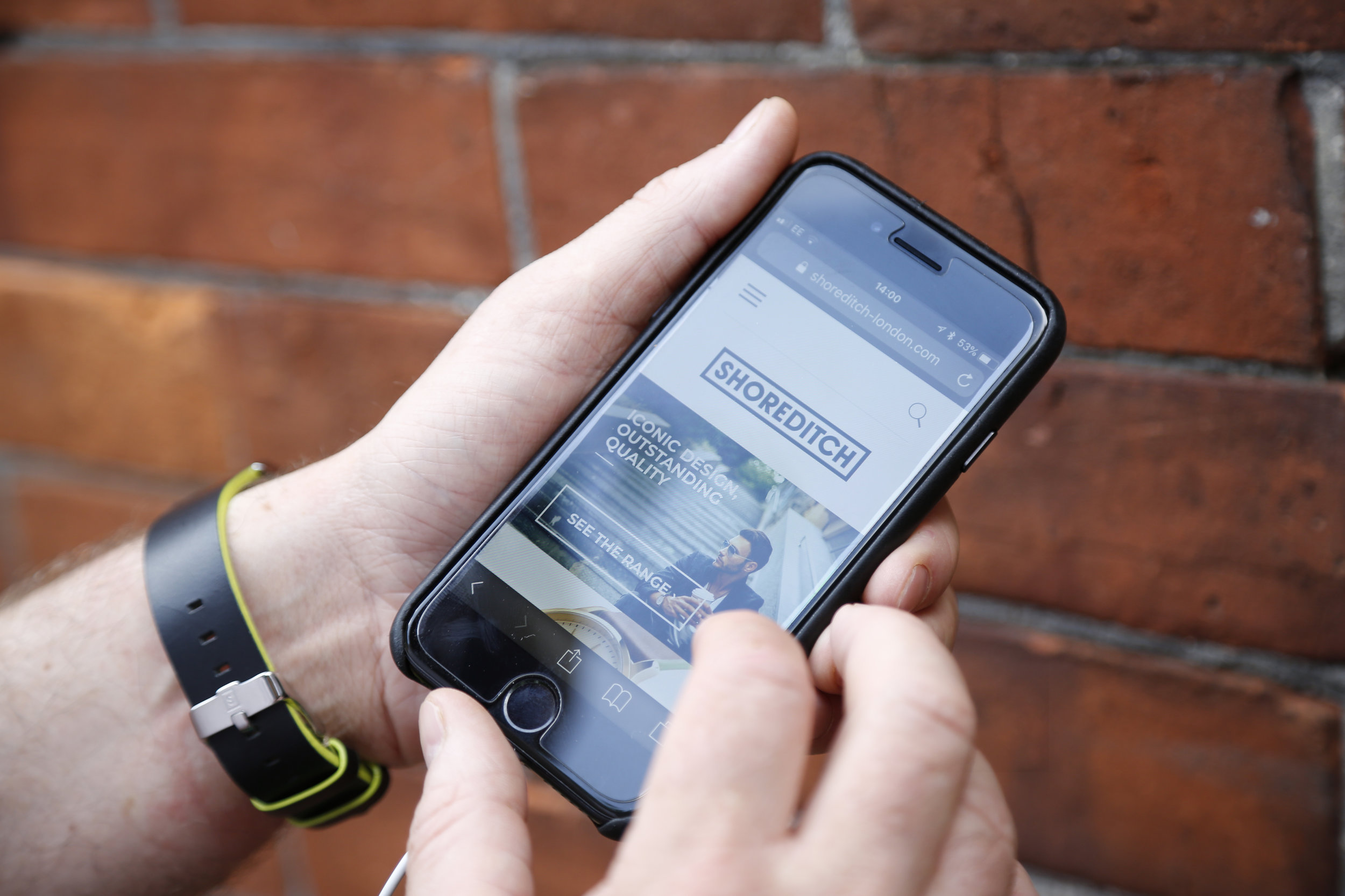
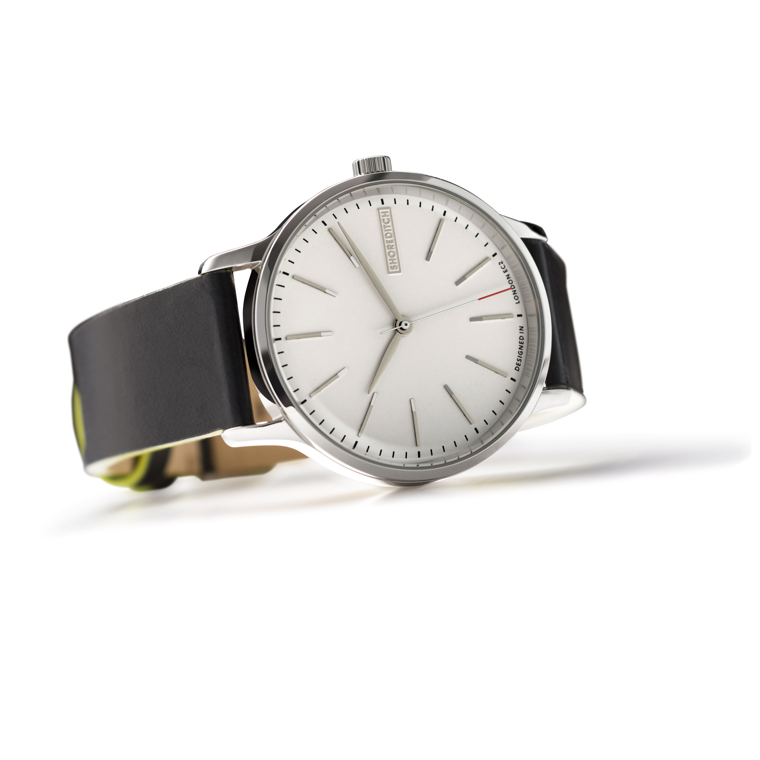
A new watch brand, from scratch, for the Global Travel Retail market.
BACKGROUND: Everything was needed: brand creation, positioning, naming, brand identity, product design, packaging, sales materials, photography, manuals, warranty cards, point of sale and web look and feel. A full brand world.
BRIEF: The only stipulation: that it be firmly rooted in the heart of London.
CREATIVE SOLUTION: I undertook a brand positioning and naming exercise looking for gaps in the market.
Shoreditch fit with the desire for a contemporary feel, underpinned by British craft and detailing. The district has a rich legacy in design: Clerkenwell for watchmaking, Hackney shoe-making and Brick Lane brewing. Shoreditch is where London’s history and the innovative worlds of modern art, design and technology come together.
Overseeing the whole design and branding process I liaised directly with the best watch manufacturers. Supplying them with technical drawings and pushed for the highest standards of production. Every detail of the range was designed right down to the union flag motif on the winding crown, the engraved Shoreditch triangle on the back and the stitch details on the straps. I managed all the prototyping and signed of production samples in collaboration with the client.
RESULTS: Shoreditch is not just another brand marque. It was designed in the district, under exacting standards and with a unique character to appeal to travellers world-wide.
DISCIPLINES: Brand design, Product design, Marketing Material, Website and Packaging